|
GSAK (Geocaching Swiss Army Knife)
| |||||
|
Form(sForm,sOptions) : String A form consists of a series of form statements (similar to settings variables used in the MacroSet command). You can create a form in a text editor with the raw data elements, but it is recommended that you use the Forms Designer for the initial set up and any changes to the positioning of controls on the form. sForm - The code that makes up the form to display sOptions - Provided for future enhancements. Currently you should just enter as "". Use the string return value of Form() to determine how the user exits the form. Possible values: SystemExit - The user clicked on the Red X button at the top of the form DelayExit - The form used a "Delay" property, and the delay timer reached zero without any user intervention Control Name - The name of the control that caused the form to exit. Currently the only controls that can cause a form to exit are Buttons and Comboboxes. 
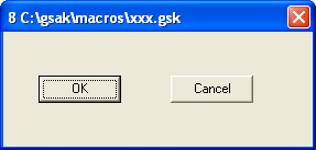
This is probably best illustrated by a simple macro that uses the form function:
![]() Forms and variables You communicate with your form via variables. Except for the type Form, Group, Image, and Label, an internal GSAK variable is allocated to each control to reflect the value of the control. Type CheckBox and Radiobutton are Boolean variables, date is date, and all others are string variables. To populate your form control with required data, just allocate a value to a variable with the same name as the control. For example, if you have an edit box and you want the default value to show as "Test" (without the quotes) the code would be:
This will result in the following form being displayed: ![]() Any changes you make to the form, will then be reflected in the corresponding variable $data. Forms contain controls and controls have properties. Every control must have a name property and a type property and they must be specified in that order. Each property must be on a separate line. The name property is the unique name given to the form control for later reference (and declaration of variables for many controls), and the type property identifies the type of control on the form. All other properties are not mandatory and can be specified in any order. To change form values see the EditForm() function Supported controls: Button - A button that can be clicked on (doing so causes the form to exit) Checkbox - A check box for yes/no type selection CheckListbox - A group of check boxes for multiple selections that are not mutually exclusive (use radio buttons in a group box if the choices are to be mutually exclusive) Combobox - A box that provides a drop down list of choices Date - A type of Edit control that allows input of Dates (with pop up calendar) Edit - A text box allowing user input File - A type of Edit control that allows browsing for a file Folder - A type of Edit control that allows browsing for a folder Form - The actual form you are about to create Groupbox - A "container" to group other controls Image - Add a graphic/image to a form Label - A text label Memo - Similar to Edit but allows for longer text input and display Radiobutton - When one of a few options can be selected (options must be mutually exclusive) Supported properties As previously stated, only name and type are mandatory. All controls default to a different height and width, but you can alter the defaults by specifying your own values. All controls support the following 8 properties. Container - The control container (see extra notes) Height - Vertical height of the control in pixels Left - Position from the Left, which is the number of pixels relative to the container Name - The control name Top - Position from the top, which is the number of pixels relative to the container Type - The control type Visible - Yes, No. Width - Horizontal length of the control in pixels Note: If you omit both the Top and Left properties for the form, it will default to being displayed in the centre of your GSAK screen. All other controls default to 0,0 for Top and Left respectively. Some properties can only be used with certain controls: AutoSize - Image control only (see below) Caption - Used by Button, Form, Label, Groupbox. This is the text description that this control will show Color - Supported for all controls except File, Folder, Image, Button. This is a number (Use "Macro=>Color picker" to select the corresponding color number (though the forms designer will automatically do this for you). Columns - CheckListBox only. This allows you to specify the number of columns for the list box. See further explanation and sample of the CheckListBox below Container - Every control has a container, and each control defaults to having the form as its container. Only a named Groupbox can be specified for the Container property (or blank to default to the form). When using the properties Top and Left, they are always relative to the control's container. Groupbox containers can be used to group like controls together, but should especially be used with radiobuttons. As only one radio button can be selected per container, this allows you to have multiple groups of radio buttons on a form. Note: You must always define the container before any controls that use this container. Delay - Used by Form only. Number of seconds before the form will automatically close DirectInput - ComboBox only. Use to specify that the user can directly input any value at all in the combobox. Currently, when you add a combobox to a form you can only select from the list of values for that combo box. This property when set to Yes will allow the user to directly enter any value rather than only those listed. Basically it turns the control into a combination of edit/combobox. Display - Use by Combobox only. Combo boxes on forms default to 8 entries before you see the scroll bars to access more than 8. This property allows you to control this value File - Image control only. (see below) Font - Used by label and memo only. Allows you to specify the font name to use for the label caption or memo details. Enabled - Yes, No. Used by all controls except the form. The enabled property set to "No" will automatically show the control in the "gray ghost" outline and prevent the user moving focus to it and changing data. Enter - Yes, No. Used by buttons only. If yes, then when you press "Enter" on the keyboard, this button is activated. (also see button note below) Error - Form only. You can use the "Error" property on the form to give the user an error box when the form is displayed. The error property accepts the name of a variable, and any data in this variable will cause the error box to trigger. (see the editform() example) . Escape - Yes, No. Used by buttons only. If yes, then when you press "Escape" on the keyboard, this button is activated (also see button note below). ExitOnChange - Yes, No. Used by ComboBox only. Setting this value to Yes will cause the form to exit immediately a combobox value changes. Use this option when you want to change something on the form (and then redisplay it) as the result of a change in the selected combox. ReadOnly - Yes, No. Used by Memo only. Set to Yes to prevent the user from updating the contents of the memo data. No allows the user to update. ReSize - Image control only. (see below) Scrollbars - Vertical, Horizontal, Both. Used by Memo only. Specify to show the corresponding scroll bars Size - Used by label and memo only. Allows you to specify the point size of the label caption. Note: Not all, but many fonts only support the smallest size of 8 regardless of the value you enter. Source - Image control only. (see below) Spellcheck - Used by button only. You can only specify the name of a memo or edit control here. When there is a named control set, clicking the button will no longer exit the form and return control to the macro. The sole purpose of the button will now be to spell check the corresponding control. Style - Used by label and memo only. Allows you to specify the caption style. Supported styles are bold, italic, underline, strikeout. You can allocate any combination of these values to the style. Just separate each value with a ; (semi colon) TabOrder - The Taborder property applies to all controls than can receive input focus and regulates the order the controls will jump to when using tab on the keyboard. This means it doesn't matter what order the controls are defined in your code - the Taborder property will decide your tabbing order.Existing forms (without the taborder property) will automatically be allocated a Taborder property to each control when you load the form. In these cases, the order will be the same as your controls are defined in the code. However, once the form is saved and the Taborder property is in your form code, it will take precedence over the order you defined the controls. Taborder is a "smart" property. For example, if you set the value of a control to say 7, then any existing control that has a tab order of 7 will automatically be changed to 8, and all higher tab numbers will be incremented by one. Also note that the tab order is relative to the container, so controls inside a group box have their own tabbing order starting at zero. The group box itself has a tabbing order within its container as well (usually the form) Don't be alarmed if you update your form and see Taborder values starting at 8. The macro form has a few "hidden" controls that take up tab slots. You can actually use any number you like for the Taborder (even zero). You just need to remember that tabbing order is respected in an ascending numerical sequence Values - Combo and CheckBoxList only. Specify the variable that will contain the values to populate these controls. Each single value to show should be separated by a ; (semi colon) Wrap - Yes, No. Used by Memo only. Determines if the text will wrap within the memo control. Has no effect if you set the horizontal scroll bar to show. Note: Buttons also support another common Windows/Form convention. When allocating the "Caption" property of a button if you precede any letter of the caption with &, that letter then becomes the Alt- hot key for that button. You will also notice the caption of the button shows this character with and underline so you can see this is the Alt- combination required to activate it. This hot key can then be used at any time from any control to action that button. The CheckListBox needs a little more explanation, especially the columns property which can be confusing, so I will try to explain in more detail. The columns property allows you to specify the number of columns for the list box. If left blank the default is 0 (no columns). When the number of columns is = 0 the control will automatically add a vertical scroll bar if the number of checkboxes will not fit into the size of the control. If the number of columns is > 0 (multi column mode) then a horizontal scroll bar will be added to view any check boxes that won't fit into this number of columns. Warning - Scroll bars, sizing , viewing, and positioning of the check boxes is automatically done by Delphi and varies depending on the number of controls and the height and width of your control. I have no control over this "automatic" behaviour, so you will need to test the combination that best suits your layout. The Delphi help file gives this explanation of the columns property - quote:
The values property is a ; (semi colon) separated list of check box names. For each name a check box list will be added. If using the forms designer, these check boxes will be shown in real time so you can test the layout especially when used in combination with the columns property. Finally, a macro variable with the same name as the control is created to contain the "checked" box names. This is also a ; (semi colon) delimited list. It is also bi-directional. That is, you can set this variable with a list of check box names that you want to automatically show as checked when a form is shown. You read this variable on form exit to find out the box names that have been checked. The following is a simple macro to give you an example of what this control looks like in action:
Note how the control looks in this example when the columns are set to 3 ![]() Changing the columns to 2 would produce this result ![]() Changing the columns to 1 would produce this result ![]() Changing the columns to 0 would produce this result: ![]() The image control allows you to show images on your form. Properties which are unique to the image control: Autosize - Set AutoSize to Yes to ensure that the entire image is visible within the image control. When AutoSize is Yes, the image control resizes to accommodate the image. When AutoSize is No (or blank), the image control remains the same size, regardless of the size of the image. If the image control is smaller than the image, only the portion of the picture that fits inside the image control is visible (another words, the image is cropped). To resize the image to fit the image control rather than resizing the control to fit the image, use the ReSize property. File - This is the file name of the image. The file extension [1] must be valid for that image type. If the source property is "File" then this should be the fully qualified path to the image file on disk. When in design mode, if the image exists on your hard drive it will always be displayed in the image control. This enables you to see how the image will look on the form. At run time the image actually displayed depends on your source property. Resize - Set Resize to Yes to cause the image to assume the size and shape of the image control. When the image control resizes, the image resizes also. Resize, resizes the height and width of the image independently. Thus, unlike a simple change in magnification, resize can distort the image if the image control is not the same shape as the image. To resize the control to the image rather than resizing the image to the control, use the AutoSize property instead. Note: Resize has no effect if the image is icon. Source - Select "File" to have the image loaded from a file on the hard disk (as specified in the "file" property). Select "Macro" when you want to embed the image inside your macro, and use this image instead. You embed the image by mime encoding an image from your hard disk (Macro=>Code binary file). For this to work, the variable name for the encoded data should be the same name as the control (see example) [1] Supported image file formats are gif, jpg, jpeg, bmp, ico, emf, wmf. The following code shows how to show an "embedded" image on a form:
If you run this macro it should produce this screen: ![]() Summary |
|
Copyright 2004-2008 CWE Computer Services Privacy Policy Contact |