A list of check boxes to use for multiple yes/no type selections. A GSAK string variable with the same name as the checklistbox is created and the value on form exit is the current value in the checklistbox.
Supported properties
Color - This is a number (Use "Macro=>Color picker" to select the corresponding color number (though the forms designer will automatically do this for you).
Columns - The number of columns of check boxes
Container - The control that the combobox control "belongs" to. Every control has a container, and each control defaults to having the form as its container. Only a named Groupbox can be specified for the Container property (or blank to default to the form). When using the properties Top and Left, they are always relative to the control's container. Groupbox containers can be used to group like controls together. Note: You must always define the container before any controls that use this container.
Enabled - Yes, No. The enabled property set to "No" will automatically show the control in the "gray ghost" outline and prevent the user moving focus to it.
Font - Allows you to specify the font name to use for the label caption of all the check boxes.
Height - Vertical height in pixels
Left - Position from the Left, which is the number of pixels relative to the container
Name - The checklistbox control name
Size - Allows you to specify the point size of the label caption for all check boxes. Note: Not all, but many fonts only support the smallest size of 8 regardless of the value you enter.
Style - Allows you to specify the caption style. Supported styles are bold, italic, underline, strikeout. You can allocate any combination of these values to the style. Just separate each value with a ; (semi colon)
TabOrder - The Taborder property applies to all controls than can receive input focus and regulates the order the controls will jump to when using tab on the keyboard. This means it doesn't matter what order the controls are defined in your code - the taborder property will decide your tabbing order. Taborder is a "smart" property. For example, if you set the value of a control to say 7, then any existing control that has a tab order of 7 will automatically be changed to 8, and all higher tab numbers will be incremented by one.
Also note that the tab order is relative to the container, so controls inside a group box have their own tabbing order starting at zero. The group box itself has a tabbing order within its container as well (usually the form) Don't be alarmed if you update your form and see taborder values starting at 8. The macro form has a few "hidden" controls that take up tab slots. You can actually use any number you like for the Taborder (even zero). You just need to remember that tabbing order is respected in an ascending numerical sequence
Top - Position from the top, which is the number of pixels relative to the container
Type - The control type, which must always be "CheckListBox"
Values - Specify the caption/label for each corresponding check box. Each single caption/label should be separated by a ; (semi colon)
Visible - Yes, No. If set to "No" then the button will not be visible on the form
Width - Horizontal length in pixels
Notes: The columns property allows you to specify the number of columns for the list box. If left blank the default is 0 (no columns). When the number of columns is = 0 the control will automatically add a vertical scroll bar if the number of checkboxes will not fit into the size of the control. If the number of columns is > 0 (multi column mode) then a horizontal scroll bar will be added to view any check boxes that won't fit into this number of columns. Warning - Scroll bars, sizing , viewing, and positioning of the check boxes is automatically done by Delphi and varies depending on the number of controls and the height and width of your control. I have no control over this "automatic" behaviour, so you will need to test the combination that best suits your layout. The Delphi help file gives this explanation of the columns property - quote:
Use Columns to specify the number of columns, in a multi-column list box, that are visible without having to use the horizontal scrollbar. Multi-column list boxes have a horizontal scrollbar that allows users to view multiple columns as they wrap. The default value for Columns is 0, meaning that the list box is not multi-column. That is, users can scroll only vertically and the list of items will not wrap. For Columns values greater than 0, multiple columns accommodate the items as they wrap beyond the bottom of the list box. The Columns property specifies the number of columns that are visible without having to horizontally scroll the list box. The width of each column depends upon both the Width property and the number of Columns. |
The values property is a ; (semi colon) separated list of check box names. For each name a check box list will be added. If using the forms designer, these check boxes will be shown in real time so you can test the layout especially when used in combination with the columns property.
Finally, a macro variable with the same name as the control is created to contain the "checked" box names. This is also a ; (semi colon) delimited list. It is also bi-directional. That is, you can set this variable with a list of check box names that you want to automatically show as checked when a form is shown. You read this variable on form exit to find out the box names that have been checked.
The following is a simple macro to give you an example of what this control looks like in action:
$cb = "option2;option7" $formexit = form($form,"") msgOk msg="Checked boxes: $cb" <Data> VarName=$form #******************************************************************** # Form generated by GSAK form designer on Sun 02-Sep-2007 09:41:00 #******************************************************************** Name = Form1 Type = Form Height = 251 Width = 296 Name = cb Type = Checklistbox Columns = 3 Height = 73 Left = 24 Top = 40 Values = Option1;Option2;Option3;Option4;Option5;Option6;Option7;Option8 Width = 225 Name = btnOk Type = Button Height = 25 Left = 40 Top = 168 Width = 75 Caption = OK Name = btnCancel Type = Button Height = 25 Left = 144 Top = 168 Width = 75 Caption = Cancel <enddata> |
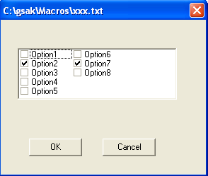
Note how the control looks in this example when the columns are set to 3

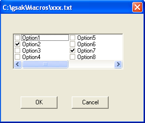
Changing the columns to 2 would produce this result

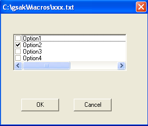
Changing the columns to 1 would produce this result

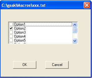
Changing the columns to 0 would produce this result:


